Mike Matas: Redefining How We Interact With Technology
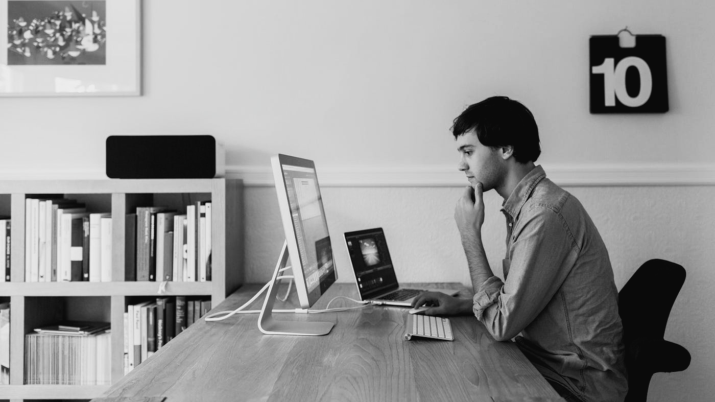
In the world of interface design, few resumes are as quietly influential as Mike Matas’s. A teenage prodigy turned Apple designer, and now part of Jony Ive’s LoveFrom collective, Matas’s journey traces the evolution of modern user experience design. It’s a story of simplicity, tangible interfaces, and a career spent making technology feel more natural.
A Young Designer with Big Ideas
Mike Matas was sketching interface ideas before he had a driver’s license. Born in 1986, he grew up fascinated by how things work and how they could work better . As he recalls, upgrading from pencil and paper to Photoshop as a teenager “set [him] loose” in turning ideas into shareable designs . Those early experiments led to real software projects while he was still in high school. Alongside veteran Mac developer Wil Shipley, Matas co-founded Delicious Monster in 2004, a small software outfit with a big hit: Delicious Library . This app let users catalog books, movies, and music on a digital bookshelf with gorgeous, photorealistic icons. It even allowed users to scan barcodes with a Mac’s camera – a forward-thinking touch at the time.
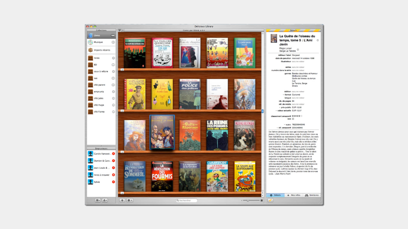
Delicious Library’s polished, tactile design was more than just eye candy; it won two Apple Design Awards for its user experience (including “Best Mac OS X User Experience” in 2005) . These accolades put Matas squarely on Apple’s radar. In 2005, at just 19 years old, he “captured the attention of Apple” and was invited to join the company’s Human Interface team . The young designer packed his bags for Cupertino, leaving behind start-up life to influence products that would soon be in the hands of millions.
Joining Apple at 19: The Interface Prodigy
When Matas arrived at Apple, he thought he’d be working on the Mac OS X interface. Instead, he found himself swept into a secret project that would redefine consumer technology: the first iPhone . Apple’s culture of design rigor was the perfect proving ground for Matas’s talents. Surrounded by legends like Scott Forstall, Bas Ording, and Imran Chaudhri, he quickly became a key contributor on a small team crafting the iPhone’s interface.
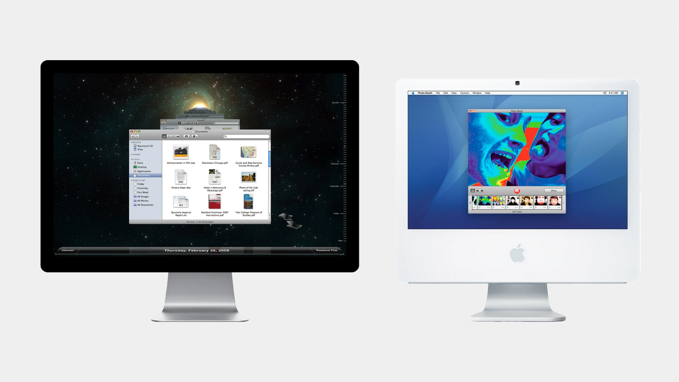
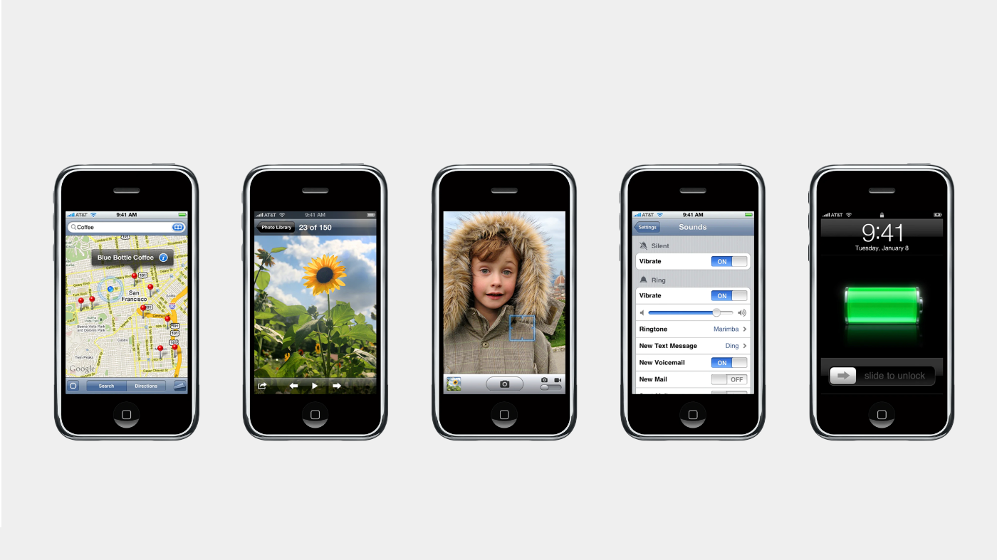
Despite his youth, Matas’s fingerprints were all over the original iPhone (2007). He helped design core apps and visuals that shaped the device’s personality. The camera and photos apps that made the iPhone a revolutionary pocket album? Matas worked on their interfaces . The pinch-to-zoom maps that put navigation in our pockets? Matas had a hand there too . Even the minor details didn’t escape him: the phosphorescent green battery icon that glows when an iPhone charges was one of his design touches . Earlier, on Mac OS X, he also designed the whimsical interface for Photo Booth (2005), which brought fun-house mirror effects to millions of Mac users. By age 20, Matas was already credited on software alongside Steve Jobs himself.
Colleagues and tech watchers dubbed Matas a “UI wunderkind” for his prolific output. He had an intuitive grasp of Apple’s design ethos: simplicity, clarity, and a focus on human interaction. One of his projects was designing Time Machine’s interface (the 3D “star field” backup utility on Mac) , where he balanced visual flair with functional clarity. As Matas later explained, his favorite designs are the ones that solve a problem and “engage you on an emotional level,” achieving a powerful balance between functionality and emotion . This philosophy meshed perfectly with Apple’s approach of making technology feel personal and even magical.
Shaping the iPhone and iPad Experience
During his four years at Apple (2005–2009), Matas contributed to a “staggering number of applications” across iPhone, iPad, and Mac . When Apple introduced the iPad in 2010, Matas extended his touch-centric design ideas to the tablet’s larger canvas. He worked on the Photos and Maps apps for the iPad, adapting the simplicity of the iPhone versions to a new form factor  . In all these projects, Matas kept pushing for interfaces that felt as natural as using a physical object.
One guiding belief for Matas was that interacting with software should be as intuitive as reaching out and using something tangible. “If you want to do something [on a computer] you should just be able to reach out your hand and do it,” he said, “no buttons, and no user interface required” . This mantra was forward-looking in the mid-2000s and perfectly aligned with Apple’s pursuit of multi-touch interfaces. Matas and his team stripped away on-screen clutter wherever possible, letting people tap, swipe, and pinch their way through content directly. The result was an interface design for the iPhone that felt alive and refreshingly simple—software that got out of the user’s way.
By the time Matas left Apple in 2009, he had helped shape the look and feel of iOS in its formative years. From the playful first Photo Booth app to foundational iPhone apps like Camera, Photos, Maps, and Settings, Matas’s work set patterns that billions of mobile users now take for granted . But for Matas, the journey was just beginning. He was ready to chase an even bolder vision of intuitive design—one where the interface might effectively disappear.
Push Pop Press: When Pages Come to Life
In 2010, Matas took a leap of faith. He left the security of Apple to co-found Push Pop Press, a startup aimed at revolutionizing digital books . Teaming up with Kimon Tsinteris, another Apple alum, Matas wanted to bring rich interactivity to publications without sacrificing simplicity. It was a chance to apply his design philosophy to a new medium: digital storytelling.
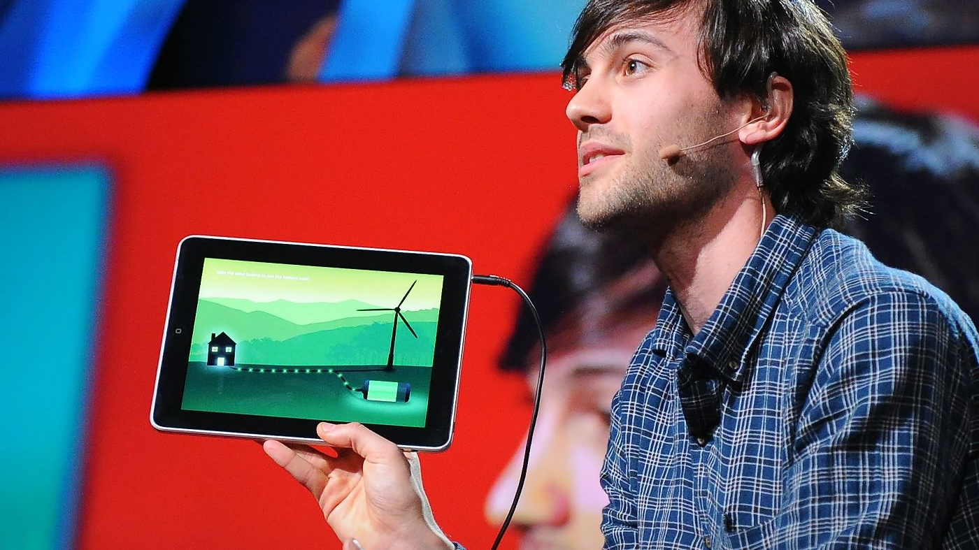
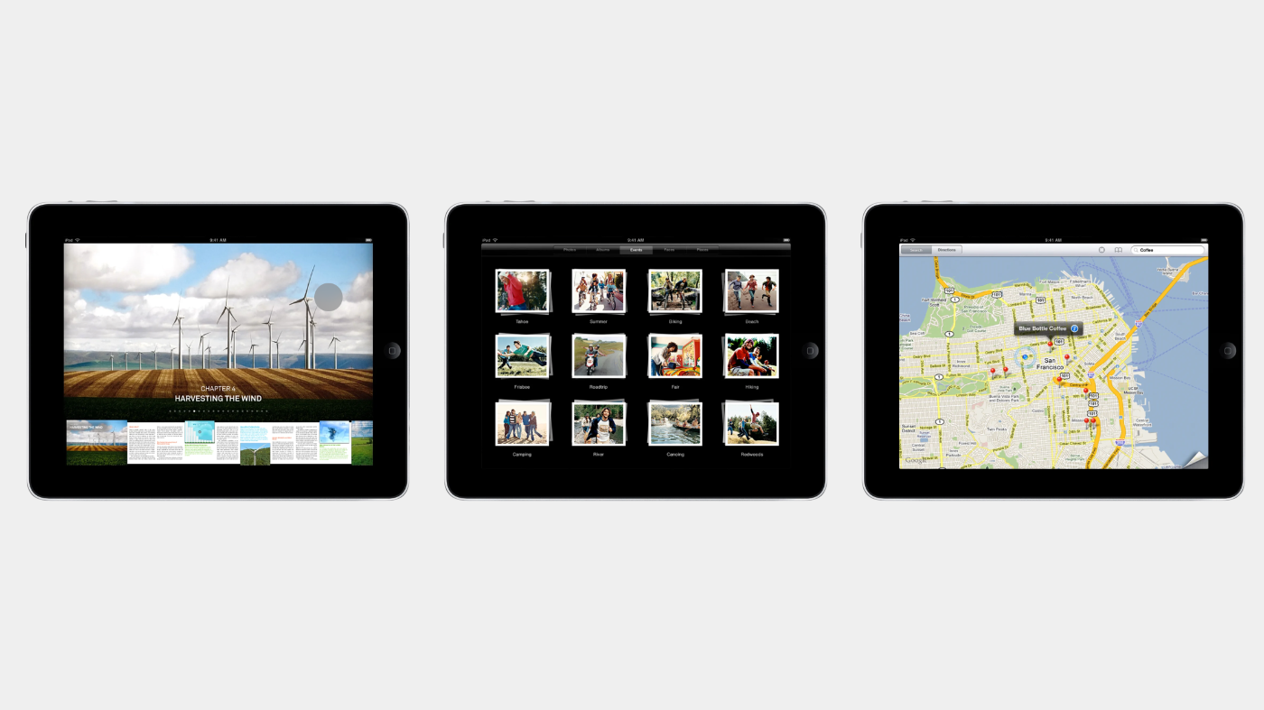
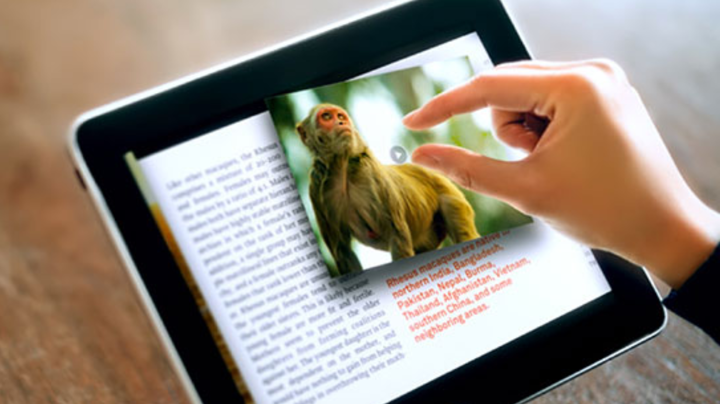
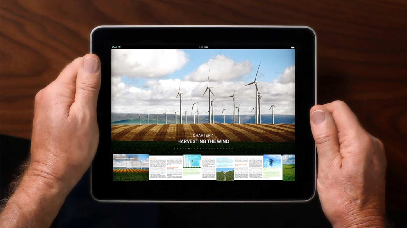
Push Pop Press’s debut project was Our Choice, an interactive ebook version of Al Gore’s climate change follow-up to An Inconvenient Truth. Matas poured his interface magic into the app, turning a static book into a tactile, multimedia experience. Readers could pinch open a photograph to reveal a video, or spin a diagram with a touch of a finger. In a memorable demo at TED, Matas even blew into the iPad’s microphone to literally spin a windmill on the screen – a neat trick symbolizing clean energy . The audience was delighted, but Matas’s point was deeper: “You can navigate the entire book this way, without any extra computer interface to stumble over… The technology disappears and you can get lost in the content,” he explained . This was the crux of Push Pop Press’s vision: make digital content feel as seamless as the real world, with interfaces so natural they’re almost invisible.
The approach resonated. Our Choice was heralded as a glimpse into the future of ebooks. It wasn’t just about flashy effects; it was about rethinking how information could be explored when freed from paper. Matas was tackling the “vexing problem” of adding multimedia to books “without losing the essential simplicity of the real thing” . That balancing act—innovation with simplicity—was classic Matas.
Push Pop Press’s promise was quickly noticed by the tech industry. In 2011, the startup was acquired by Facebook , not to build e-books, but to infuse its inventive design DNA into the social media giant. Matas’s journey took another turn: from Cupertino’s polished halls to the fast-moving world of Menlo Park.
Rethinking Social Media at Facebook
Matas joined Facebook via the Push Pop Press acquisition, bringing along his knack for human-centric design. At Facebook, he became part of a skunkworks team tasked with an ambitious project: reimagining how people consume news and stories on their phones. The result was Facebook Paper, an experimental newsreader app that launched in 2014 to critical acclaim.
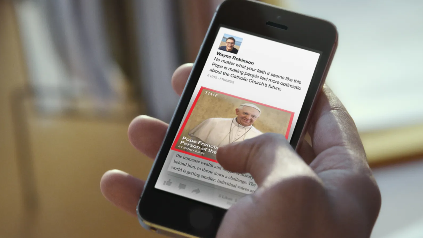
As the lead designer for Paper, Matas once again tore up the rulebook. His central question was, how do you design something on a phone screen “the size of a credit card” that captures the elegance of print media? . The answers led to one of the most refined mobile interfaces Facebook ever produced. “Their first step was to strip away the visual junk that usually accompanies smartphone apps,” Wired noted in an inside look at Paper . In place of Facebook’s typical chrome of navigation bars and buttons, Paper relied on a handful of intuitive gestures. The app introduced a gesture-driven UI where you could swipe through sections like flipping through a magazine, tilt your phone to pan across high-resolution photos, and drag cards to share articles.
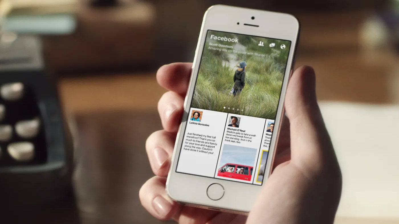
The experience was focused and immersive. “You’ll find no navigation bars and on-screen buttons,” Matas said of Paper, which instead was “built around a few simple gestures” . Each piece of content took center stage: a single status update or photo would expand to fill the screen, free from the clutter of the standard News Feed . Matas described it as akin to “going through a museum, where you tilt your head and try to understand what the person was trying to say” . This philosophy of one thing at a time was a sharp break from the endless scroll that dominated social media. In essence, Paper was another expression of Matas’s belief that good design guides the user’s focus and fades into the background.
Under the hood, Paper’s design was also an engineering feat. It featured a sophisticated, grid-based layout that could fluidly accommodate everything from long-form articles to cat photos, all without feeling disjointed . It was a testament to the idea that a “better container” for content could even encourage better content creation  . While Paper never became a mainstream hit and was eventually discontinued, it remains a beloved case study in mobile design. It showed how far Matas was willing to go to marry form and function – even within a social networking giant, he carved out a space for design excellence and experimentation.
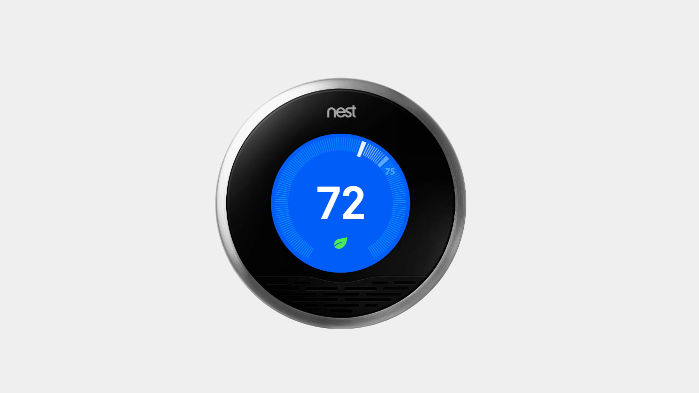
Facebook Paper wasn’t Matas’s only contribution at Facebook. He also lent his design expertise to projects like Instant Articles (Facebook’s initiative to make news content load faster and look cleaner in the app) . And notably, around the same time, Matas did contract design work on the original Nest Learning Thermostat interface  – applying his touch-based design approach to smart home hardware. In each case, whether it was a news app or a thermostat, Matas’s goal was consistent: simplify the experience, delight the user, and hide the complexity behind a friendly face.
New Frontiers: Democratizing AI with Lobe
After several years at Facebook, Matas once again felt the pull of entrepreneurship and new challenges. In 2015, he co-founded Lobe, a startup aimed at making artificial intelligence and machine learning accessible to anyone . It might seem like a departure from consumer apps, but for Matas it was a familiar theme: taking complex technology and designing an approachable interface for it.
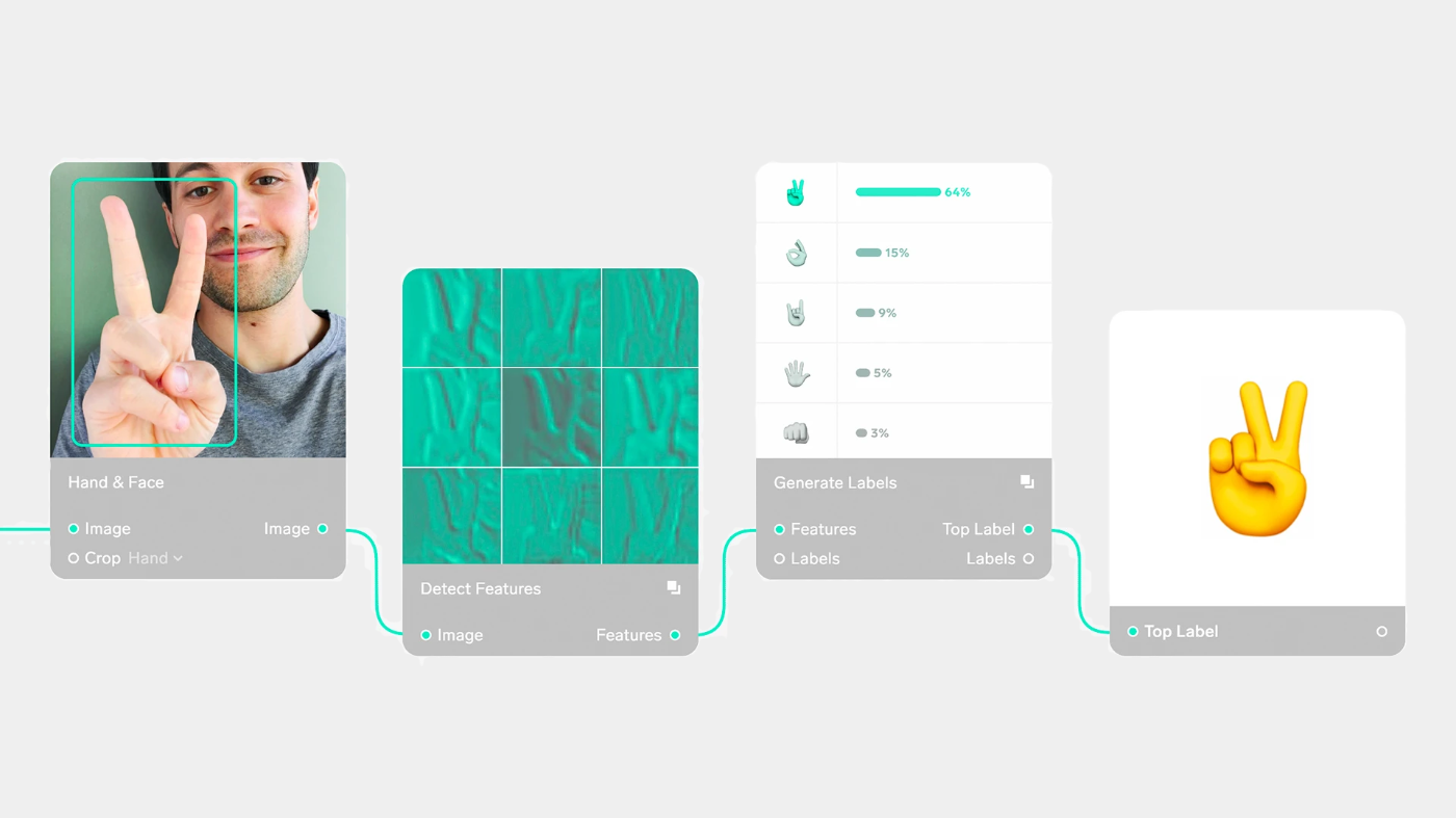
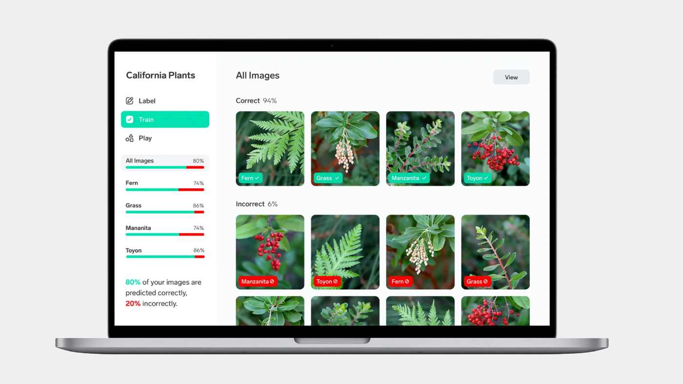
Lobe’s software allowed users to build deep learning models with drag-and-drop simplicity, instead of writing code . Underneath, it handled the heavy lifting of AI, but on the surface it presented a clean, visual canvas where non-programmers could connect the dots. In other words, Matas was doing for AI what he had done for digital books and mobile UIs – he was hiding the hard parts behind an elegant, intuitive design. “We look forward to continuing the great work by Lobe in putting AI development into the hands of non-engineers and non-experts,” said Microsoft’s CTO in 2018 , when the tech giant acquired Lobe to bolster its AI tools.
With Lobe, Matas extended his influence to the burgeoning field of AI-driven software, ensuring that usability wasn’t lost in the excitement of new tech. It was yet another instance of his career-long mission to democratize technology through design – from graphical interfaces at Apple to interactive content at Push Pop Press, and now machine learning models at Lobe.
The LoveFrom Chapter: Design at the Highest Level
Today, Mike Matas continues to practice his craft at LoveFrom, the boutique design firm led by Jony Ive (Apple’s former design chief). After leaving Apple in 2019, Ive handpicked a collective of designers and creatives to form LoveFrom, and Matas joined their ranks. On his personal site, Matas notes that he is “currently working on some new projects with LoveFrom” . While much of LoveFrom’s work remains behind closed doors, the firm has been involved in projects ranging from industrial design to brand identity.
For Matas, LoveFrom represents a kind of homecoming to the Apple design ethos, but with a broader canvas. It’s a place where his approach to design – simplicity, functionality, and a touch of wonder – can be applied to everything from consumer electronics to environmental projects. In 2024, for example, LoveFrom unveiled a playful new logo and mascot (a little animated bear) for itself, and it was Matas who shared the first look at the design on social media . Even in that tiny logo animation, one can see the hallmarks of Matas’s influence: a charming, human touch combined with precise execution.
As part of LoveFrom, Matas is likely contributing to designs that will quietly shape industries, much as his work at Apple once shaped the smartphone revolution. The exact projects remain secret (LoveFrom famously collaborated with brands like Airbnb, Ferrari, and Apple, though details are sparse), but observers can guess that any interface carrying Matas’s imprint will be thoughtfully reduced to its essence. After all, he’s spent a lifetime proving that the best design often makes its presence invisible.
The Philosophy of Simplicity and Human-Centered Design
Tracing Mike Matas’s career, a clear philosophy emerges: design should simplify and humanize technology. Whether it was a bookshelf app, a touchscreen phone, a digital book, or an AI tool, Matas approached each with an eye toward making the complex feel effortless. He’s often talked about designs that not only solve problems but also create an emotional connection . In practice, this means interfaces that invite you in, make you smile, or provoke a sense of delight – all while performing a task so well you barely notice the effort.


Matas also embodies a generation of designers influenced by Apple’s design principles but unafraid to push beyond them. He grew up alongside the rise of user interface design as a discipline, teaching himself the tools of the trade (from Photoshop to Quartz Composer) and then helping define the discipline’s state of the art. He finds inspiration in everything from niche software that declutters web pages to design blogs and photography . This eclectic curiosity fuels his work; he absorbs ideas from outside tech and brings them into the software world to make interfaces more intuitive.
Colleagues have noted how Matas’s work has a certain “texture” – a term he himself used to describe the feel of Facebook Paper’s varied content presentation . It’s an interesting word for a digital designer to use, and it speaks to his aim of making bits and pixels feel tactile and real. In an era when digital experiences can often overwhelm, Matas consistently chooses the path of refinement and focus. His designs invite users to do more by presenting less on the surface.
Legacy and Ongoing Impact
Mike Matas’s journey from precocious teen designer to seasoned industry veteran is more than a personal success story – it’s a roadmap of how modern interfaces have evolved. At Apple, he contributed to products like the iPhone and iPad that have changed the world’s relationship with technology. At Facebook, he challenged the norms of social media design, showing that even our news feeds could be rethought. Through startups like Push Pop Press and Lobe, he’s proven that good design can transform how we consume content and even how we approach complex fields like AI.
Perhaps most telling is how often Matas has been at the forefront of the next big thing. He was making skeuomorphic, shelf-like interfaces in the mid-2000s to make digital media feel familiar . He was designing touch interfaces for phones when that was brand new. He explored interactive ebooks before the iPad was commonplace, and he dived into AI tools well before “no-code” was a buzzword. In each case, the through-line is a commitment to user experience over all else. Matas’s influence is present in the swipe of a touchscreen, the gentle animation of a charging battery, and the intuitive flow of a well-designed app.
Now at LoveFrom, working alongside other design luminaries, Matas has come full circle to a context that values design at the highest level of strategy. He’s part of the heritage of designers who aren’t just decorators of products, but foundational thinkers of how products work. His career is a testament to the idea that when design is woven in from the start – with empathy for the user and clarity of purpose – it can create technology that feels like an extension of ourselves.
Mike Matas may not be a household name like his mentors or peers, but his work has quietly touched billions of users. In the swipe of an iPhone, the engaging interface of a digital book, or the simplicity of training an AI model with drag-and-drop, you can feel his philosophy at play. It’s a blend of simplicity and functionality, honed over years and applied with an artist’s eye. As technology marches on, designers like Matas ensure that our experience of the future remains, at its heart, profoundly human .
Sources
- Killeen, Meghan. “Mike Matas – How one software maverick is pioneering the future of digital publishing.” Cool Hunting, 16 June 2011
- Miller, Matthew. “Inside Look at the Creation of Facebook Paper.” Wired, Feb 2014
- ”Interview with Mike Matas.” Cocoia Blog, 2010
- Mike Matas – Personal Website (Project Portfolio and Bio)
- Krazit, Tom. “Microsoft acquires Lobe, an AI startup…” GeekWire, 13 Sept 2018
- John, Daniel. “Jony Ive’s LoveFrom has an adorable new logo.” Creative Bloq, 26 Sept 2024